
Population density maps have multiple implications, e.g., to help relief agencies to better plan where they are needed most in case of disaster and in demographic, economic and environmental research. However, in large parts of the world, it has always been difficult to produce accurate and consistent population (density) maps based on existing census data.
Three well known initiatives to produce consistent and high resolution population (density) maps are the Gridded Population of the World (GPW), the Global Rural-Urban Mapping Project (GRUMP) and the Worldpop data. The first two, both published by SEDAC, come at a resolution of 30 arc seconds (approximately 1 km at the equator). The Worldpop data set comes at a higher resolution of 3 arc seconds (approximately 100 m at the equator) (Tatem 2017). This was achieved by disaggregating census data using machine learning algorithms with remote sensing data and other data sources (Stevens et al., 2015).

For an overview of the differences between different data sets, including the three mentioned above, check out the Popgrid Viewer by SEDAC. It provides a comparison of key characteristics of each data set. In addition, it provides an online viewer in which you can compare the maps side by side.
Recently, an even higher resolution population density map has been published by Facebook in collaboration with other parties. It is based on a mixture of machine learning techniques, high-resolution satellite imagery population data and OpenStreetMap (OSM). The result is a population density map at the impressive resolution of 1 arc seconds (approx. 30 meter at the equator). That is at the scale of a (large) building (!).
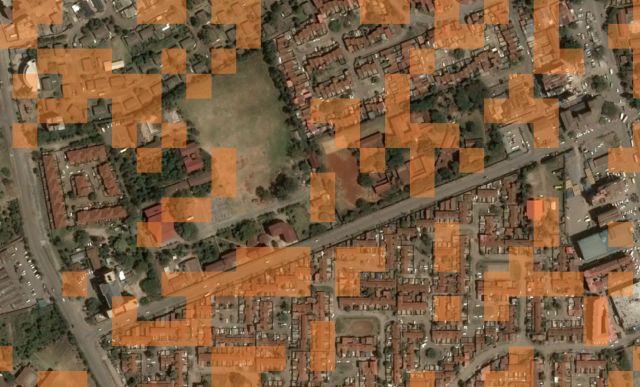
Population density in a neighborhood of Nairobi, Kenya. 
Population densities on the slopes of Mount Kenya 
Population density at the neighborhood level
The images in the gallery above show that you should not expect to be able to identify individual houses in high density urban areas. On the other hand, it gives a pretty good idea of where people live on more remote areas on the slope of Mount Kenya. All in all, this map seems to capture the distribution of people across the landscape more accurately and at higher resolution than other maps mentioned earlier.
Of course, it is not only about spatial resolution. It is also about the accuracy of the population density estimates. In that respect, it is important to remember that the density estimates depend on the accuracy of the underlying census data, and that this data is largely the same as used in the maps mentioned earlier. On the other hand, at resolution of this map, you can actually start to compare population density estimates with the actual number of people in your block, and thus validate the map at a very local, sub-neighborhood level.

Pingback: High resolution maps of the human population density in Africa – GeoNe.ws